REBRAND

Bison Excavation was founded in 2018 as a family owned and operated business by Charlie & Mackenzie Pino in Peoa , Utah. Bison Excavation supports the greater Summit County and Wasatch County region.
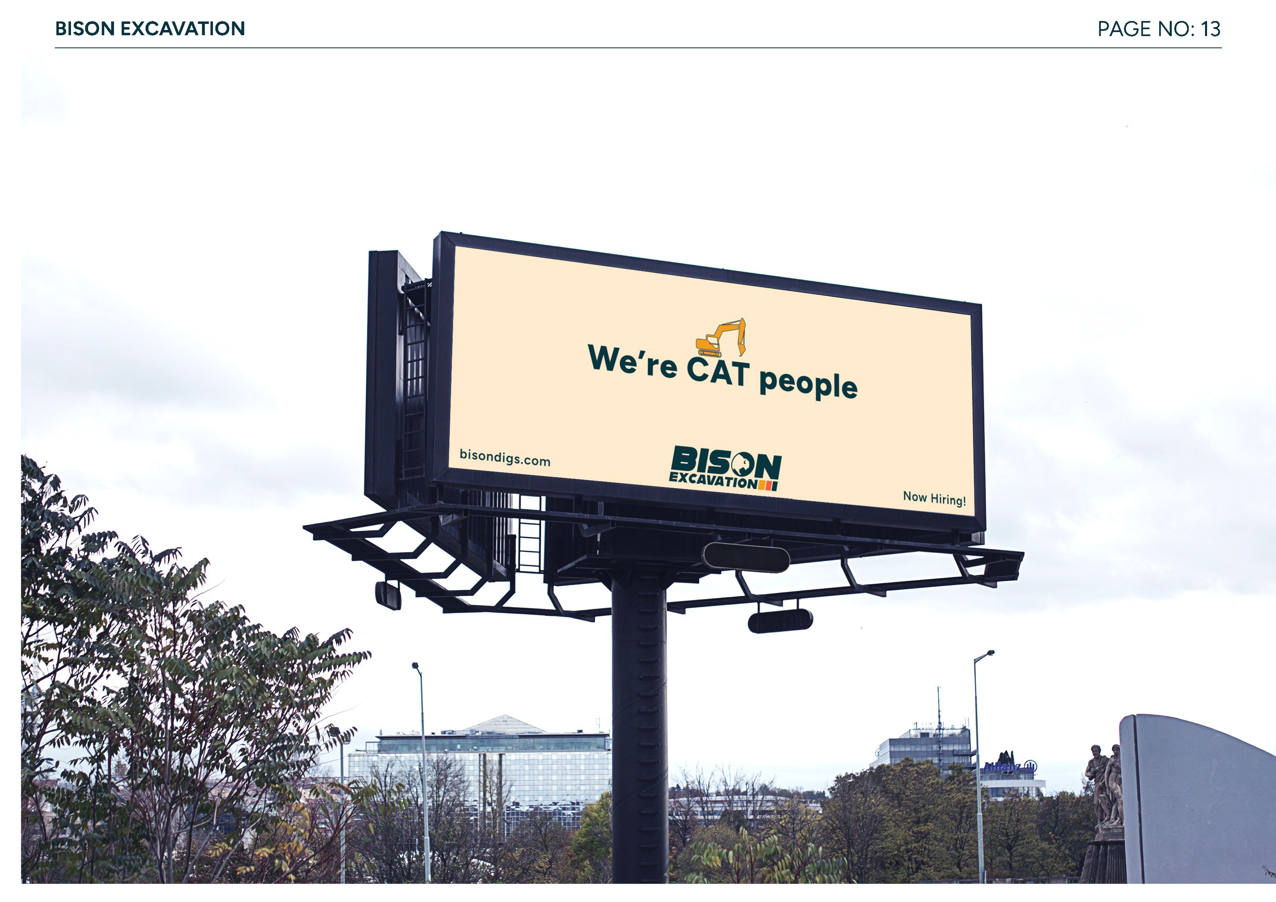
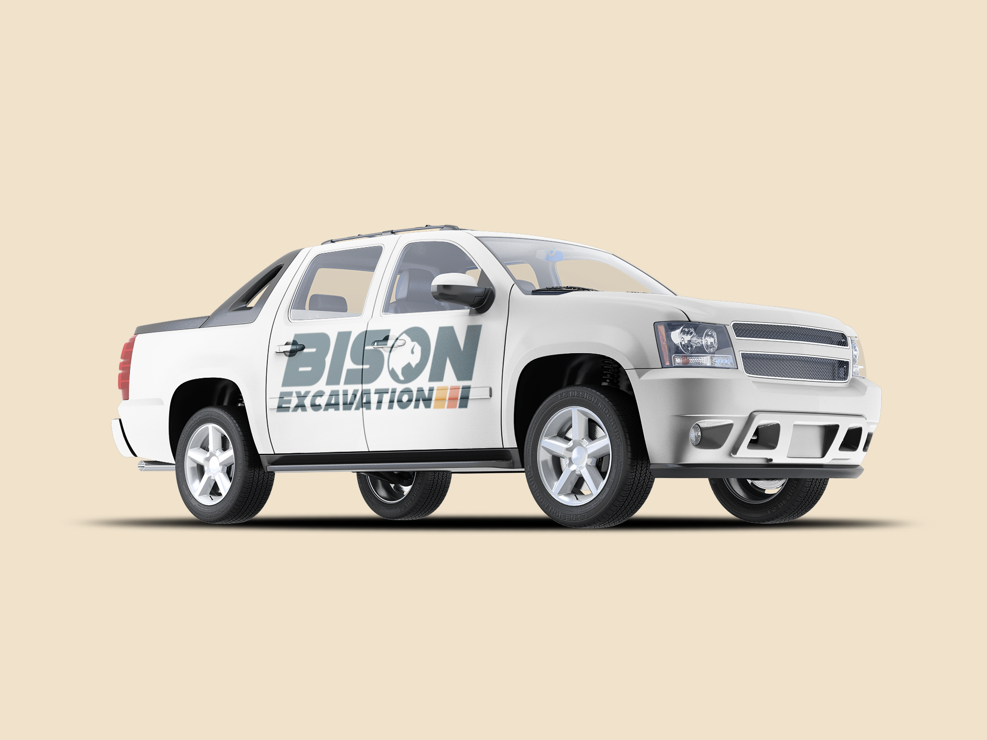
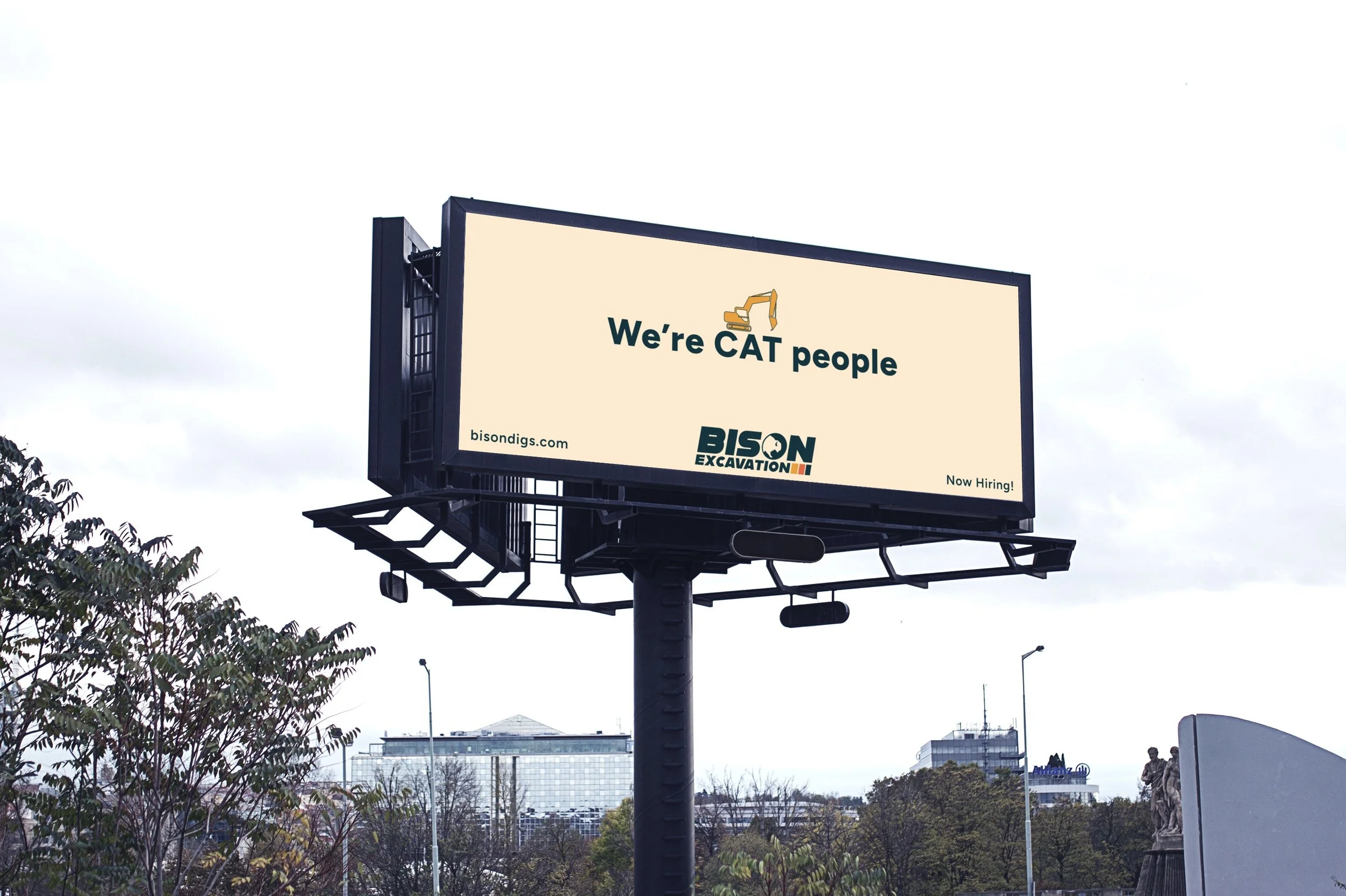
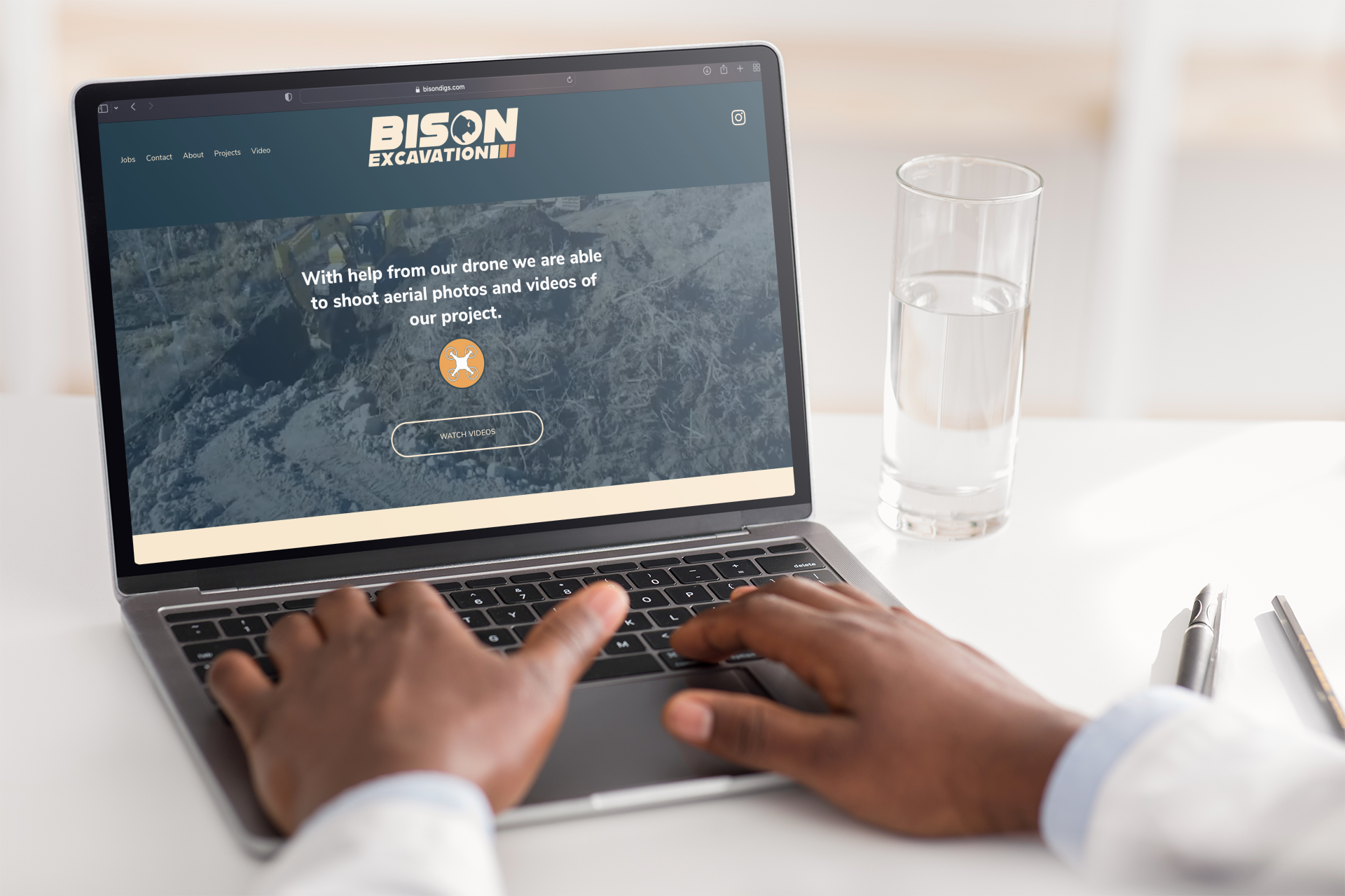
The goal of Bison Excavation’s re-brand was to modernize the profile of the company, and inspire confidence with it’s customers through a cohesive visual identity. Through nostalgic color usage and a wide variety of logo variations, we now have the flexibility of branding options with updated imagery we can be proud to show off and on site.
LOGO LOCKUP
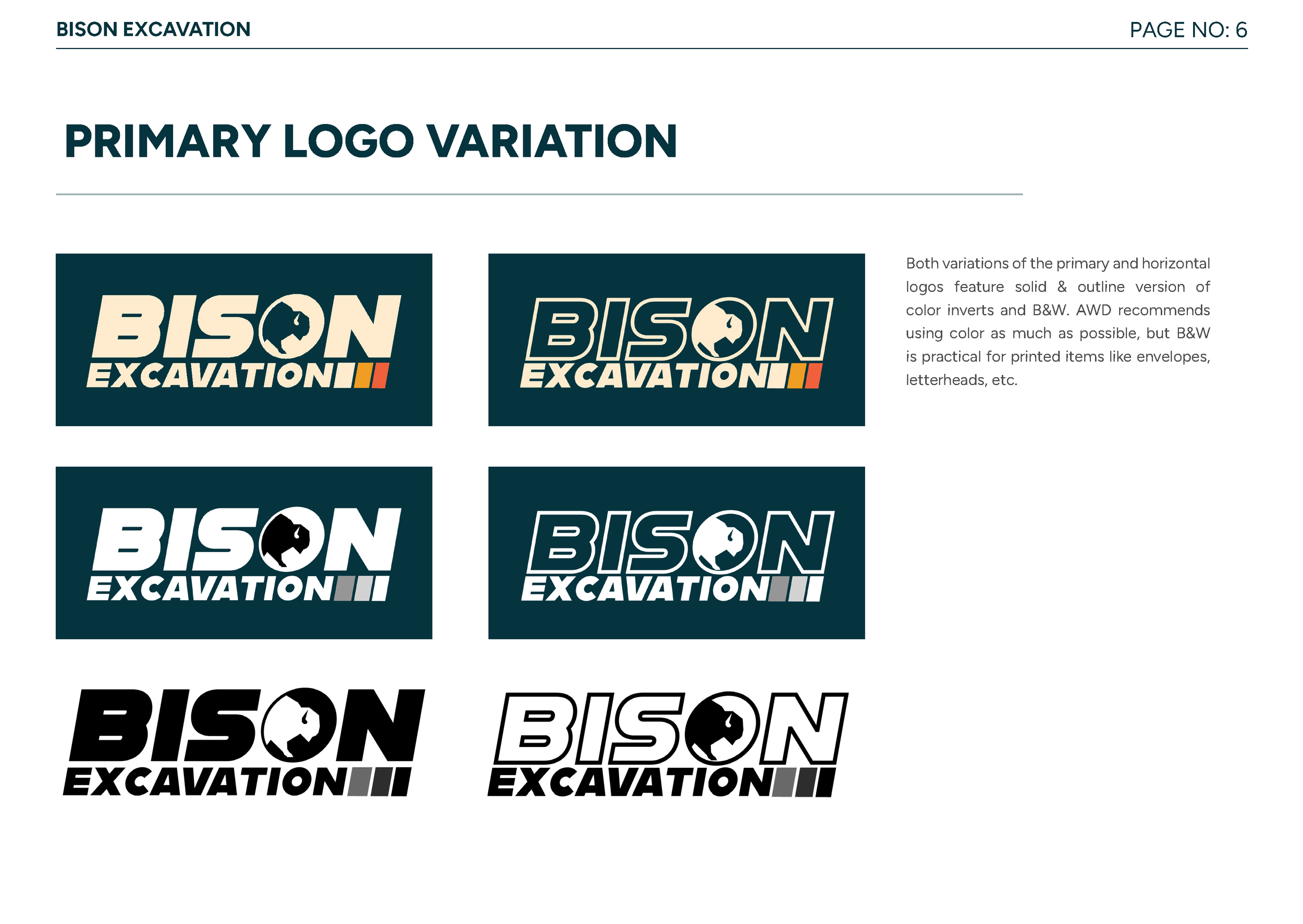
PRIMARY LOGO
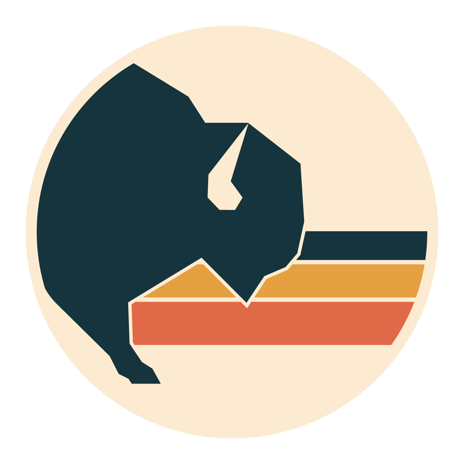
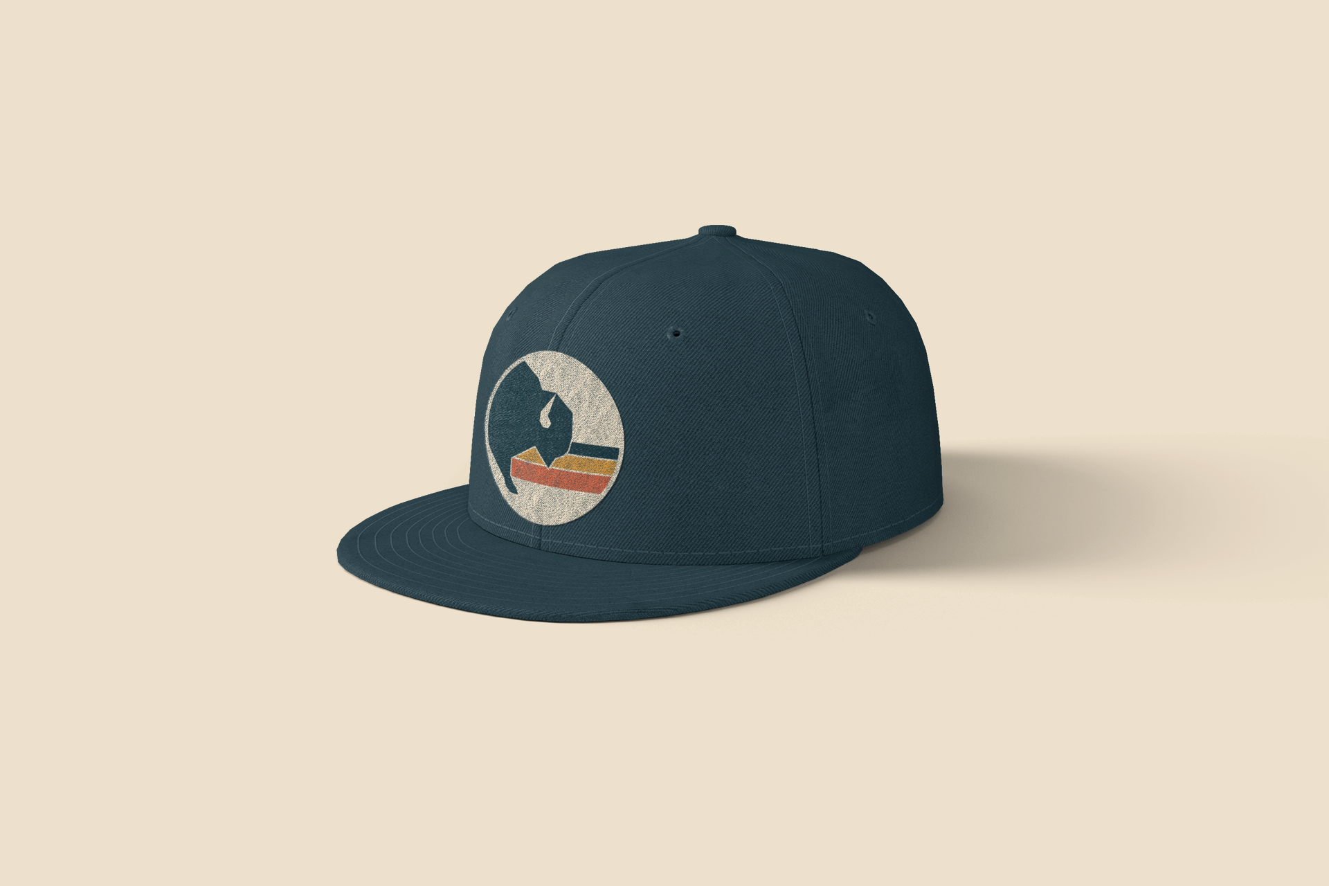
The primary logo has two variations - one transparent and one solid. We call this the Stacked Primary Logo as reference to the two words “stacked” on top of each other. We incorporated the geometric bison “stepping out” of the O, and those primary color blocks to pay homage to the 80’s inspiration.
The sheer slant of the logo sits at 10 degrees, to evoke forward movement and a feeling of motion.


HORIZONTAL LOGO
Like the primary stacked logo, this has two variations - one transparent and one solid. We incorporated the primary color blocks, but with a grounding
The sheer slant of the logo sits at 10 degrees, to evoke forward movement and a feeling of motion.


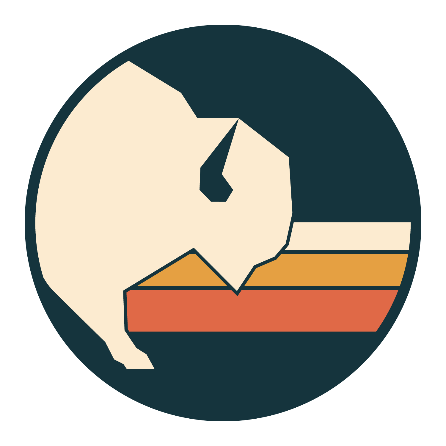
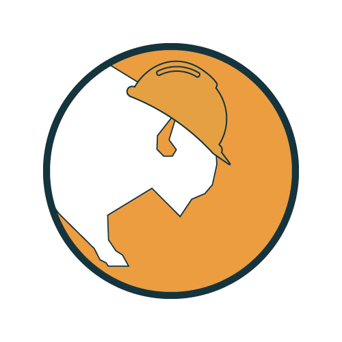
LOGO MARK
Taking the bison stepping out with the strong color blocks, ties the brand & logo together for a strong visually identity. This mark should be used for social profile pictures, stickers, favicons, anywhere an image vs. letters will do better.

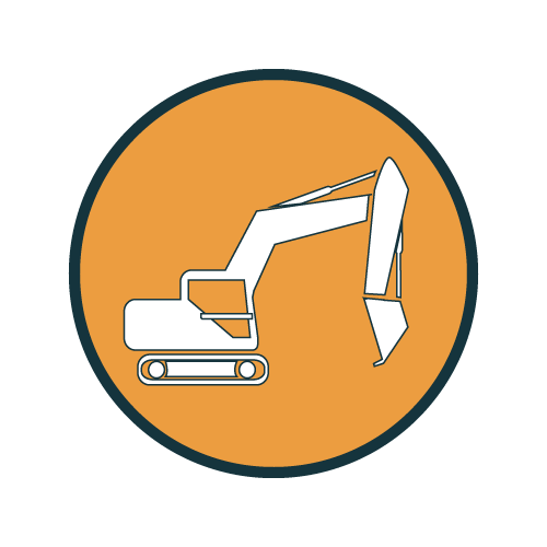
ICONOGRAPHY
To be used for social highlights, website iconography, and marketing products.


BRAND GUIDE
BRAND GUIDE